Art Criticism
Monday, May 13, 2013
Beth Wilson: Lucid Dreaming, Wherever You Go, There You Are
According to the way in which Barrett described how to effectively criticize art, Wilson's critique is exemplary. She gives us insight into the background of the artworks and artists that allows for deep insight into the pieces. She does not get wrapped up in describing the art in a complicated or confusing way. Using eye-catching phases such as "inventiveness" and "impenetrable tangle of wires" she both captures the readers attention and describes the pieces very accurately. Wilson also makes many cultural references, likening the pieces to famous movies and places. In that regard she is very engaging to the reader. The rich imagery she uses in physically describing the art makes it very easy to picture it visually. The way that Wilson is able to engage with the reader is definitely her strong point. In reading the article, I felt more like I was talking to a friend who was telling me about an exhibition they saw, rather than reading a dry, academic-style critique.
Saturday, May 11, 2013
Barrett Chapter 3
In
Chapter 3: Describing Art, Barrett tells us how to effectively criticize
art. The three most important aspects to
look at for effective art criticism are subject matter, medium and form. It is also necessary to provide background
information. This can be information
about the artist, artwork, or the time period and culture in which it was
created. Putting a piece into historical
text can give viewers a sense of how and why it was created. The medium which an artist chooses can give
us great insight into an artwork, and this aspect is often overlooked. Form is equally important, as it gives
information about how the artist chooses to present their artwork. It is also important to note not only what
the artist includes, but what they exclude as well. The best critics are able to engage their
readers with their writing style and descriptions. By writing with passion and importance, they
can make a huge difference in the interest their readers take in the art and
how engaged they become. A critic could
be describing the most beautiful work of art ever created, but if they have a
dry writing style it will likely get little attention.
Thursday, March 21, 2013
Artist Response 7: Vik Muniz continued
"The Castle At Bentheim, After Jacob Van Roysdael"
"Individuals"
"Marinara Medusa"
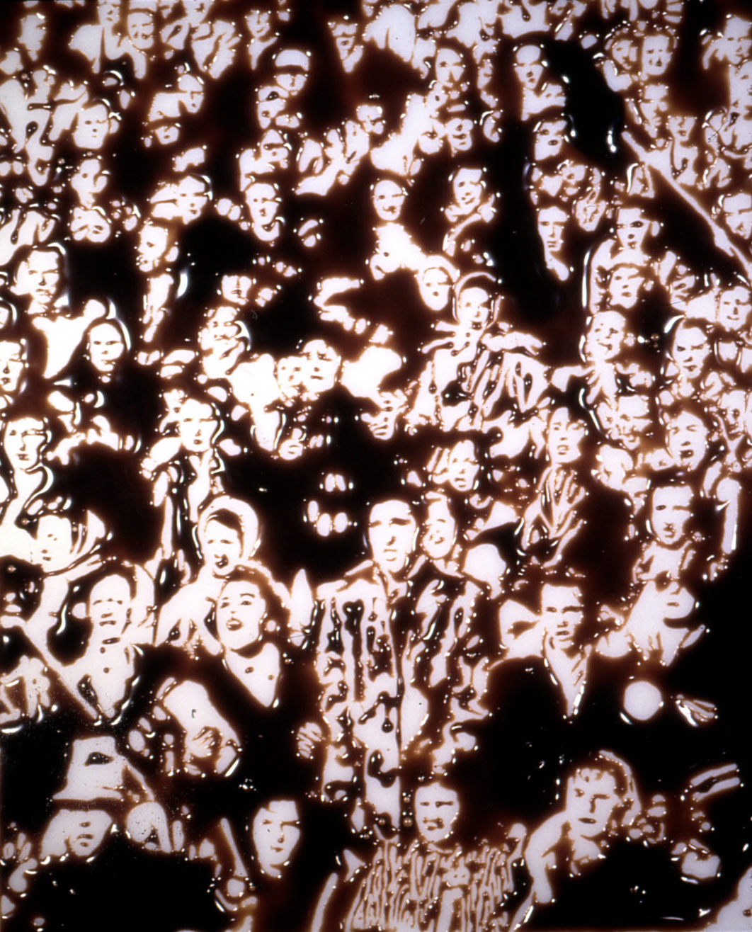
Muniz focuses primarily on medium in the above pieces. "The Castle at Bentheim" is made of sixty thousand feet of sewing string, "Individuals" is made of chocolate syrup, and "Marinara Medusa" of actual spaghetti. These real-life mediums are a symbol to everyday life, as the materials are all household items. In his review of Muniz' work in Masters of Deception, Al Seckel details how Muniz attempts to create visually provocative artwork through use of a wide range of mediums. He uses the fact that humans tend to draw quick conclusions about what they see to his advantage, often using images that already exist, but changing them in a way that changes the way people think about them. According to Muniz, changing the way people think is one of the primary goals of his artwork, but he claims to go about it a little differently than Seckel says. He uses the layers and non-traditional materials to make it more difficult for the viewer to understand the piece. This way, they engage the piece in a more in depth level, and are led to analyse it deeper than they would other artwork. The thousands of feet of sewing thread used in "The Castle at Bentheim" entirely alters the way the image is viewed. The thread makes the image seem as if it is all interconnected and flowing together. It is far more provocative and leads to a wider range of connections and conclusions by the viewer than a traditional photograph or painting would.
Thursday, March 14, 2013
Artist Response 6: Vik Muniz
 |
  |
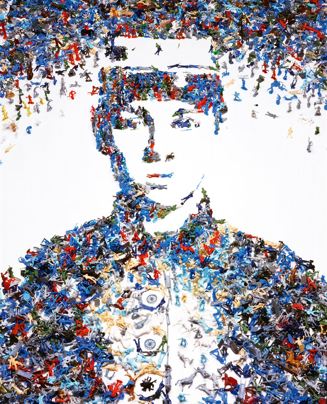
Vik Muniz uses non-traditional materials in order to create astounding works of art. His choice of materials often reflects a double-meaning he instills in his work. His art often presents the viewer with a familiar image at first glance, however when they are looked at more closely, they are incredibly intricate images. The piece on top, titled "Toy Soldier," is a collage of a civil war soldier, formed by fallen toy soldiers. It is an incredibly thought provoking piece in many ways. Two major ideas I pulled from this piece are that war is treated as a game. Through pop culture, video games, movies, etc. war is seen as a game, as the real-life tragedies it causes fall by the wayside. Also, I felt that "Toy Soldier" described the way which people have become numb to the death tolls and casualties in war. Anyone who watches the news knows that there are daily killings and horrific tragedies caused by war across the world. Hearing about these events so frequently, however, it is easy to see them as simple statistical numbers (represented by the toy soldiers), and to forget the real humans that are devastated. The piece in the bottom right is titled "Le Songeur, After Corot." Like his other pieces, the material Muniz chose makes it spectacular, as it is made of forty-eight thousand feet of sewing thread. The above image doesn't really do the original justice, I found a much better copy in a library book. The detail that Muniz is able to achieve with so thin a material is incredible.
Wednesday, February 27, 2013
Artist Response 5: Doris Salcedo

Doris Salcedo's work send very powerful, stark messages. Of the above works, the one in the top left appeals to me the most. I had the opportunity to see this piece in the Boston ICA last year, and it strikes me as a very interesting, thought-provoking piece. It is composed of a wooden chair encased in concrete and held together by several steel bars. What appeals to me about it is its rigidity, the sharp lines as well as the very weathered surface of the concrete. I believe this piece is telling a story about education. The chair she used is very similar to those used in schools. The piece is showing how a strict education system can indoctrinate a child, and lead to a very closed-minded way of thinking. Upon entering school, a child has a very open and light mind, represented by an empty chair, that can adapt to and engage many new things. As time goes on however, the child's mind becomes weighed down with sets of rules, structures, and ways of thinking that are taught to them. The rigidity and weight of a material such as concrete demonstrates how someone's mind can become permanently locked into a way of thinking, unable to adapt to new situations and ideas. I think this piece is challenging not only strict styles of education, but the whole idea of learning in a classroom as well. It's a statement that learning about the world while sitting in a chair will not get you far, you have to go out and experience new things for yourself to develop and mature educationally.
Monday, February 25, 2013
SPA 3
Douglas Beube's above piece represents human activity in a number of ways. He is showing that when looking at people from a distance, many of us appear to have similar purposes, do activities in a similar way, and look similar as well. He is showing that humans need to get close and engage with one another. By doing that, humans feed the creativity and ideas of one another and can create much greater things than any individual could. I think that each book represents a person and they all contain separate information and ideas that together, strengthen them as a whole. Everyone has their own niche, and each one is equally important.
Subscribe to:
Comments (Atom)


